
[Group 15] Team Members: Austin Patel, Ashley Chang, Dominic de Bettencourt, Jennessa Ma
Video:
https://drive.google.com/file/d/1RKa_RfW383JYNej35Qxv3SvANqlT6y4c/view?usp=sharing
Abstract
In this project, we make two main contributions: 1) We implement a method that takes in fonts in the TrueType font format and rasterizes letters on the screen, and 2) we create a method that takes in two different fonts and interpolates between them to generate "blended" fonts. The rasterization process involves loading Bézier control points from the font file and using De Casteljau's algorithm to render Bézier curves that define the outline of the font. For the interpolation process, we sample 100 evenly spaced points along each contour of a letter rendered with two different fonts, and then linearly interpolate between these points to generate the interpolated font. Our final results include both failure and success cases for font rendering and interpolation, and we demonstrate smooth interpolation between two fonts in a convincing manner.
Technical Approach
Approach
Basic Font Rendering
We mainly used the FreeType library for loading fonts given a TrueType font file. Next, we implement the rasterization process ourselves. The steps to do this are:
- Load in the font and focus on a specific character’s
outline
- Given a specific font scale and offset to the canvas, we iterate through each
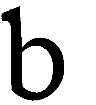
contourof theoutline(for example ‘b’ has an inner and outer contour and ‘c’ only has 1 contour) and gather a list of Bezier control points (there are many control points per contour)
- We drew out different types of curves based on the relationship between sequential pairs of 2-4 control points. These relationships are determined based off of a point’s tags:
-
FT_CURVE_TAG_ON: the point is “on” the curve. This tag means the point is the start of line segments and arcs.
FT_CURVE_TAG_CONIC: the point is “off” the curve, meaning it isn’t on the contour itself but is a control point for a Bézier arc. This tag means the point is used to control a conic Bézier arc.
-
FT_CURVE_TAG_CUBIC: the point is “off” the curve. This tag means the point is used to control a cubic Bézier arc.
-
- For every point, we include it in a set with the next 1, 2, and 3 points in the list to see how we should draw the curve between specified points:
- if there are 2 successive
FT_CURVE_TAG_ONpoints, it is a line segment:
- if the pattern is [
FT_CURVE_TAG_ON,FT_CURVE_TAG_CONIC,FT_CURVE_TAG_ON], then it is a conic Bézier arc:
- if the pattern is [
FT_CURVE_TAG_ON,FT_CURVE_TAG_CUBIC,FT_CURVE_TAG_CUBIC,FT_CURVE_TAG_ON], then it is a a cubic Bézier arc:
- if the pattern is [
FT_CURVE_TAG_ON,FT_CURVE_TAG_CONIC,FT_CURVE_TAG_CONIC,FT_CURVE_TAG_ON], then it is a conic Bézier arc with a newly created “on” point in the middle:
in this case, we draw 2 conic curves with the new “on” point being the end of the first curve and beginning of the second curve
- if there are 2 successive
- Next, we filled in the glyph using the
pointInPolygontest where every contour was treated as a polygon. This algorithm essentially checks how many sides of the polygon the given point would cross if we drew a horizontal line from the given point. If it crosses an odd number of sides on both sides of the point, it is inside the polygon. If it crosses an even number of sides on both sides of the point, it is outside the polygon. We iterate through the entire pixel grid and run the pointInPolygon test for each pixel.
Font Interpolation
Challenges
Interpolating between two fonts is challenging because each font may have a different number of Bezier control points. Because of this, instead of interpolating directly between control points, we first sample points on the contours and interpolate those points. Another challenge is of correspondence since we need to determine corresponding curve segments for each different font.
When interpolating between two glyphs, we have two main goals:
- Find a point mapping between the two glyphs - m equidistant points and anchor point
- Perform the interpolation between the two glyphs given some interpolation param
t
In order to achieve these goals, we implement the Pillow Projection method within our interpolate_letter method.
Interpolation process:
- Given 2 outlines of a glyph (representing 2 fonts): sample
mequidistant points (in our case,m = 100) on each contour for each outline. Here we use the GEOS library to aid us in these calculations.- Implementation:
- Initialize a
LineStringobject using the corresponding contour coordinates, which lets us encode the polygon outline as a sequences of lines
- Convert this
LineStringto aLengthIndexedLine, a class that helps with finding points given an offset along the contour (equidistant points)
- Using our helper function
getPointAtDistanceand the totallengthof each contour (or the length of theLengthIndexedLine), we sampledmpoints - each at a distance of apart from each other.
- Initialize a
- Implementation:
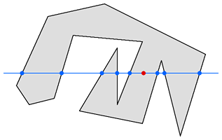
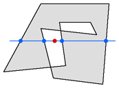
- Different fonts have different starting points for each contour. In order to properly interpolate, we want to have each contour start in roughly the same location and have the same winding order. We address this by computing which sampled point (
indexOffsetis closest to a fixed anchor point (indicated by red x in figure below) and using the closest point as the start of the contour. Reindexing: new index =(i + indexOffset) % m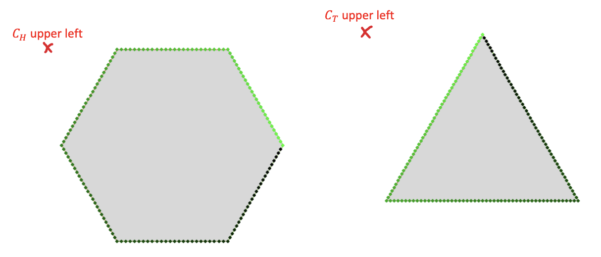
In this example, the first (0th) point of the sampled mpoints would be the one closest to the top left (figure borrowed from reference describing pillow projection method)
Lerpeach of them=100corresponding points on the other to form a new contour given atvalue using our helper functionlerp2D(simply returns(1 - t) * p1 + (t * p2)where p1 and p2 are our two points).
- With the new lerped points, we construct a new
outlineobject that has the same number of contours and set all tags to 1 (FT_CURVE_TAG_ON). This means this new outline is purely consisted of line segments and not curves (future work could extract Bezier curve from the points instead of drawing lines). This step deviates from the Pillow projection method described in the referenced paper, which fits Bézier curves from the sampled points rather than directly drawing line segments between them. We chose to just draw line segments as we sampled a large enough number of points to make the curves still appear relatively smooth and to reduce complexity in our code.
- Perform steps 3 and onwards of basic font rendering to render the interpolated font
Reflection
Problems Encountered
- Working with new libraries (i.e. FreeType, GEOS) took longer than expected as we ran into build issues and unexpected results.
- Using FreeType required modifying the
CMakeLists.txtfile, which we were not familiar with at all, and 2 of our members weren’t able to run GEOS on their computers for various reasons.
- When working with the GEOS library, we misunderstood the purpose of several data types (i.e. LineString, LengthIndexedLine, Polygon, etc.) that led to several hours of testing functions associated with various classes, reading the docs, and trying to find scarce examples online. We eventually relied on GEOS less than we thought, but still used their data types to easily find
mequidistant points.
- Using FreeType required modifying the
- Debugging was difficult at times as initially the bulk of our code existed within one method
- Our interpolation only works with letters that have the same number of contours. When we started interpolation, the task seemed a lot more difficult than we anticipated, so we narrowed our scope down to just interpolating between letters with the same number of contours. This reduced the number of fonts we could test with. For example, we couldn’t interpolate between cursive fonts and standard fonts, and we also couldn’t interpolate between characters with different numbers of contours within the same font.
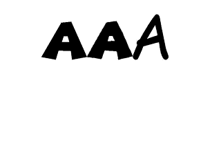
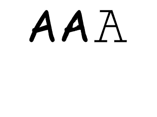
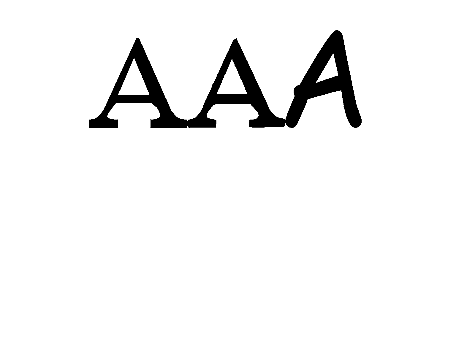
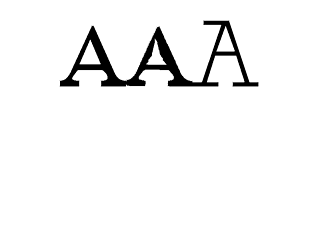
- We made the incorrect assumption that every font was created such that the contour mapping would be ordered from outer contours to inner contours. For example, the letter A: we assumed contour #1 would be the outer layer, and contour #2 would be the inner triangular contour. This was incorrect and can vary from font to font, which can be seen in Times New Roman ‘A’ to Monospace ‘A’ failure case under the “Results” section.
Lessons Learned
- Lessons learned from working with unfamiliar libraries:
- Unit testing to better understand the function of each method and to confirm expected behavior would have been helpful!
- In addition, a good practice for future projects would be to thoroughly read through documentation of relevant classes and methods instead of immediately jumping into the implementation.
- Isolating different parts of the code to make it clean and readable (overall we have about ~450 lines of code). Incorporating this project into our project 1 code was a bit intimidating so we initially started with all our code in the
main.cppfile. We soon realized it was a lot more efficient to do all the loading/initial set-up work in the main function, and separate the rest of the tasks into different files/methods. For example, we havedrawLetterthat takes in any outline and draws a letter, which is called 3 times to draw the 3 letters in each output. We have a separateinterpolateLetterfunction that takes in 2 outlines (from 2 different fonts) and returns a newoutlinerepresenting the interpolated letter. We have adrawCurvemethod that runs the De Casteljau algorithm to render a curve.
Future Improvements
- There were 2 ways to create the mapping between the points on each contour: finding an anchor point (what we implemented) or calculating rotational offsets. As seen below in the results, some of the characters were interpolating really weirdly (i.e. “A”) when interpolating between very different fonts (i.e. comic sans to a serif font). We thought this could potentially be because of the way we chose how to map the points. The rotational offset method is to first matching the points (1,1),(2,2),...,(100,100), then the next offset, matching (1,2),(2,3),...,(100,1), and so on. Whichever offset gave the smallest MSE would be the mapping we chose. This method could have made a more balanced mapping and potentially lead to less error cases.
- As stated above, one of our constraints to interpolation was only interpolating between letters with the same number of contours. A future improvement would be to implement The Reduction Method, a contour mapping technique, onto letters with a different number of contours by essentially collapsing down an extra contour to a point.
- The Pillow Projection method is also a relatively new idea outlined in the linked article, hence it may not be a perfect implementation. Additional research on different font interpolation implementations such as Relative Projection, which solves the imperfect maths in Pillow Projection and uses percentages rather than a strict mapping of points/contours, could lead to better results and less failure cases.
- Implement supersampling anti-aliasing to create smoother results.
- Implement GPU rendering to speed up the whole font interpolation and rendering process.
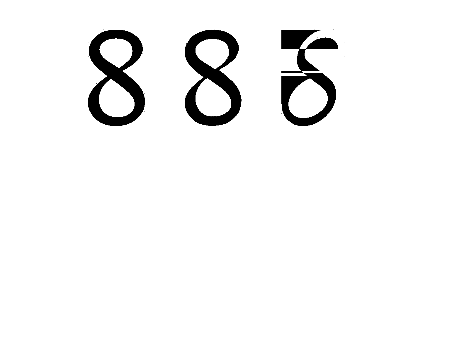
Results
Success cases:
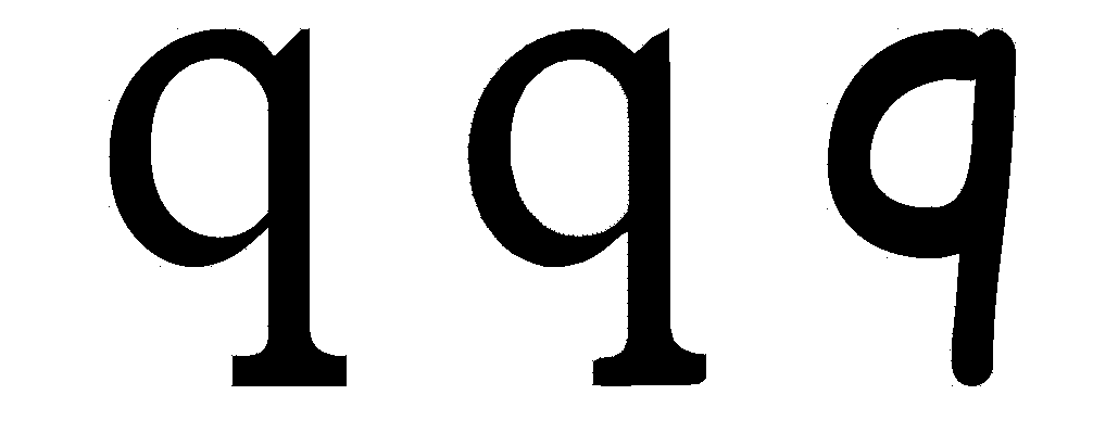
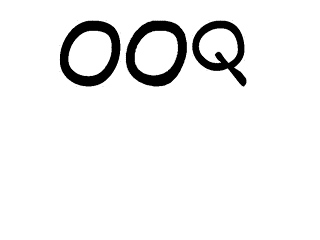
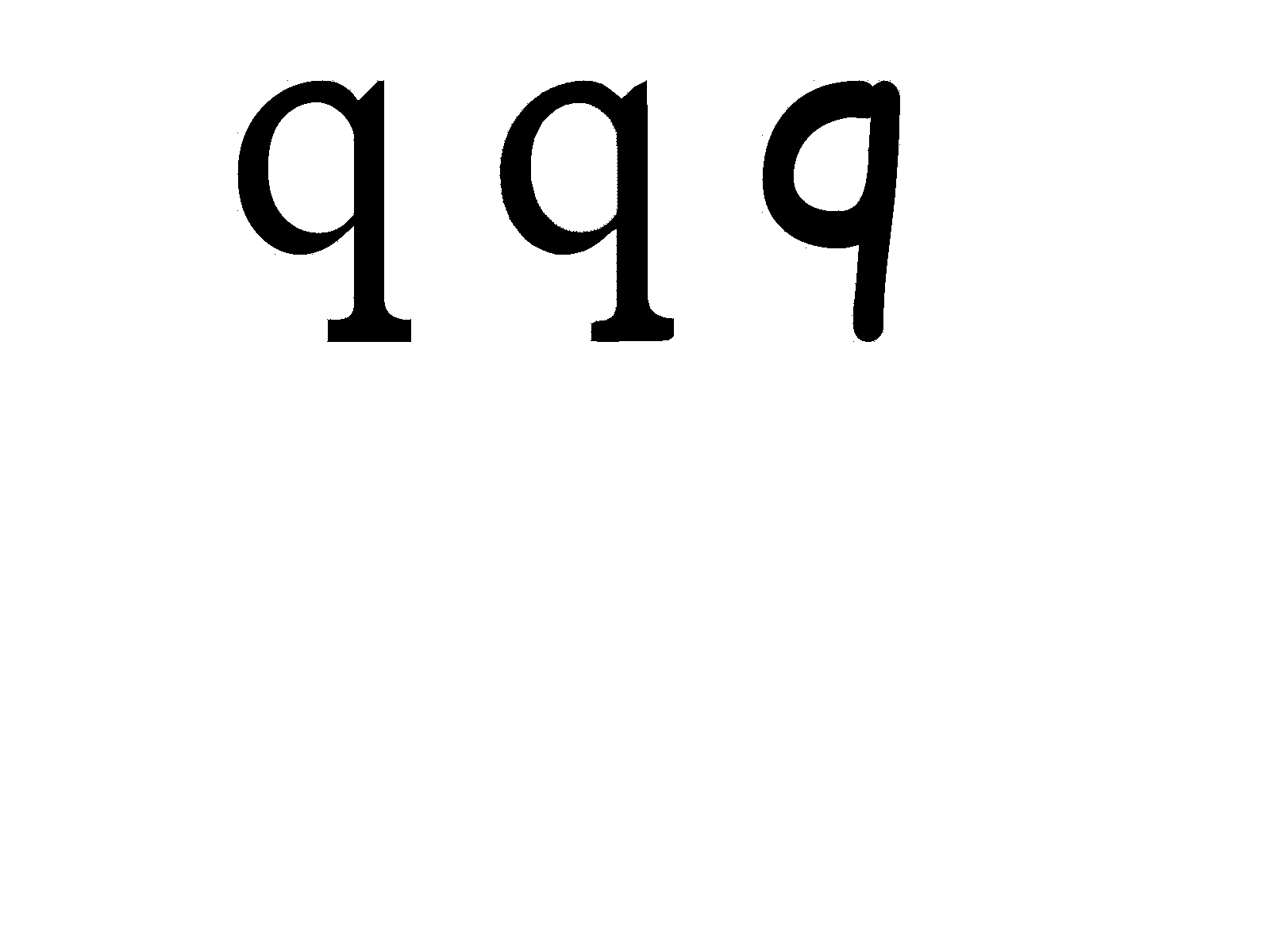
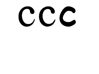
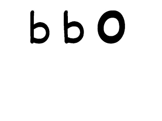
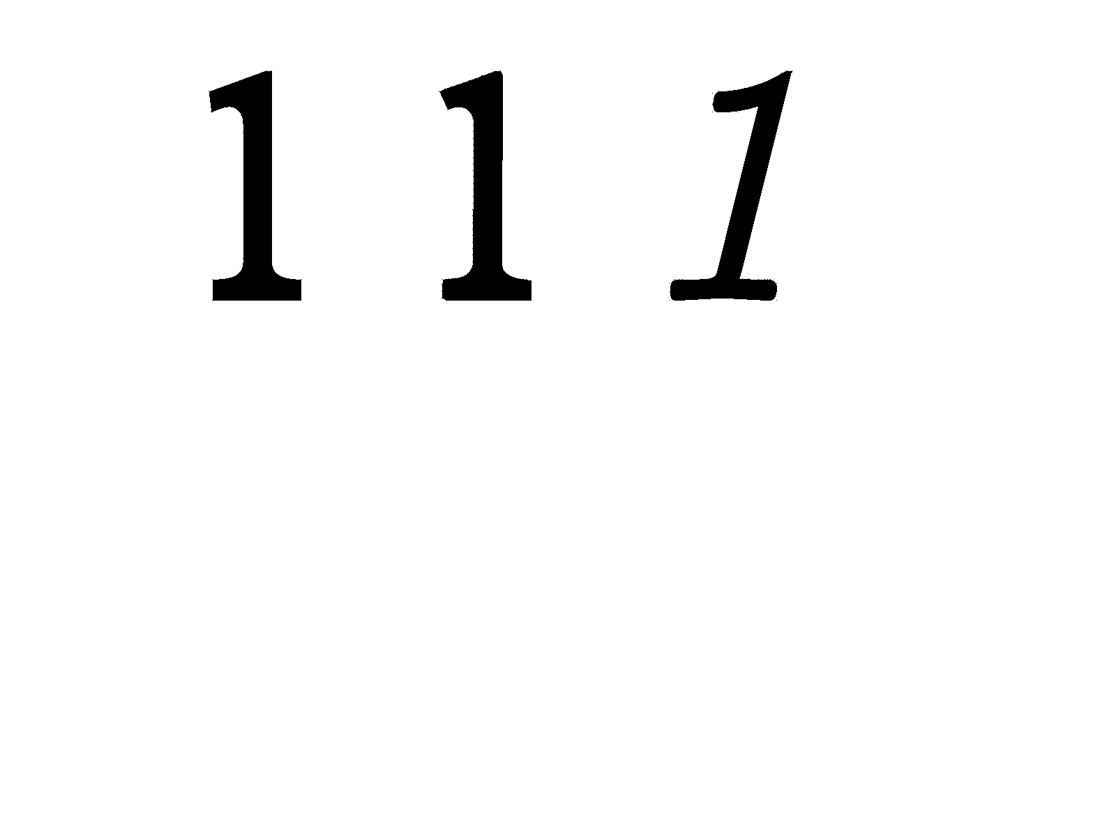
We successfully demonstrate interpolations between one font and another font for a single character for a number of fonts. We additionally demonstrate interpolation between two different characters from the same font.
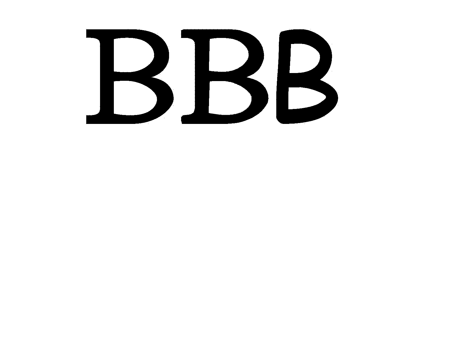
In general we saw the most success when the two input fonts are visually similar to one another (curved fonts interpolate well to curved fonts for example). Generally the intermediate results are compelling and represent a smooth transition between the two fonts. Some visual issues are present such as strange shape inconsistencies on inner contours (see the capital B example below). These interpolations consist of 40 frames of equal interpolation step between frames.
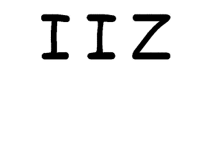
Failure cases:
Failure cases occur when the two fonts are dramatically different. In particular, we sample points evenly spaced between corresponding contours. If two contours are of different total lengths, then the sampled points will have different spacing between them and typically this leads to poor interpolation results. This is because we might be interpolating different sections of each contour since we have no guarantee that edges in each contour will be present at equal distances.
In some cases we aren’t able to render all fonts correctly before the interpolation stage. This was due to the fact that there are a number of edge cases in the Bézier curve outline rendering. One edge cases is that there are fonts with special Bézier curve that define control points in a special format (see section 1a on https://freetype.org/freetype2/docs/glyphs/glyphs-6.html for more details on edge cases).
Thirdly, we make the assumption that the winding order of the Bézier curve outlines follow the same order in both fonts. This may not be true for all font combinations.
References
- FreeType library and figures: https://freetype.org/freetype2/docs/reference/ft2-outline_processing.html#ft_outline
pointInPolygonalgorithm and figures: http://alienryderflex.com/polygon/
- Pillow Projection algorithm: https://pdfhost.io/v/7zebevzBv_FontLerp_Article_1_Export_1
Team Contributions
Throughout the entire project, everything was done all together in frequent meetings from researching algorithms, implementing the code, debugging issues, doing the write-up, recording the video, and working on all the deliverables overall. This was done by alternating who would start the code-sharing sessions on CLion, which made it easy for everyone to code together.
😤💯 teamwork #fonts 💯 😤